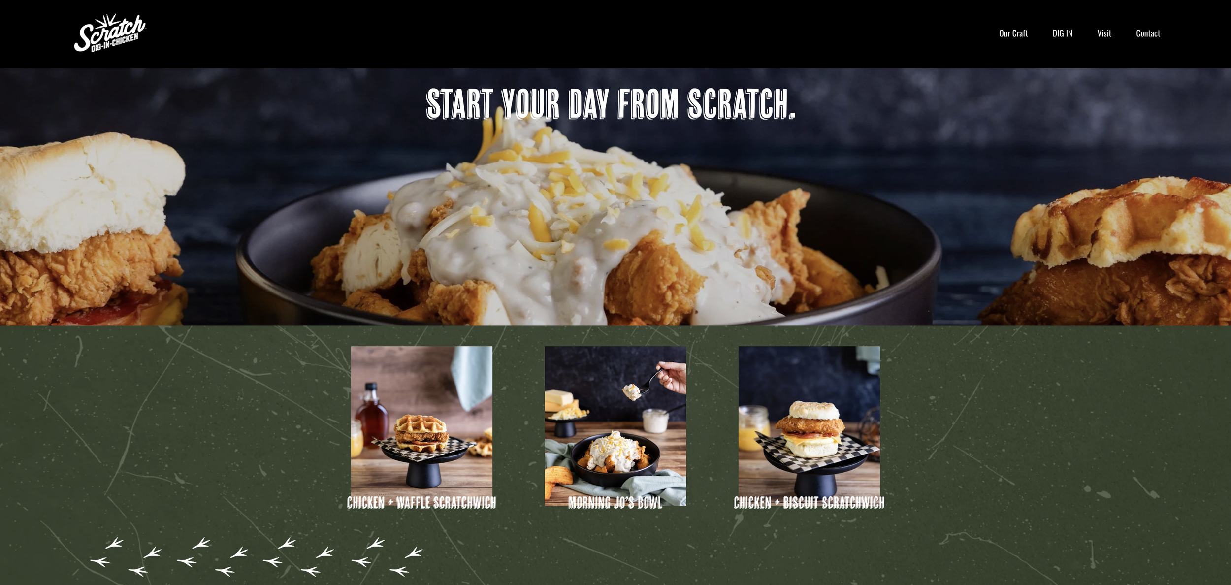
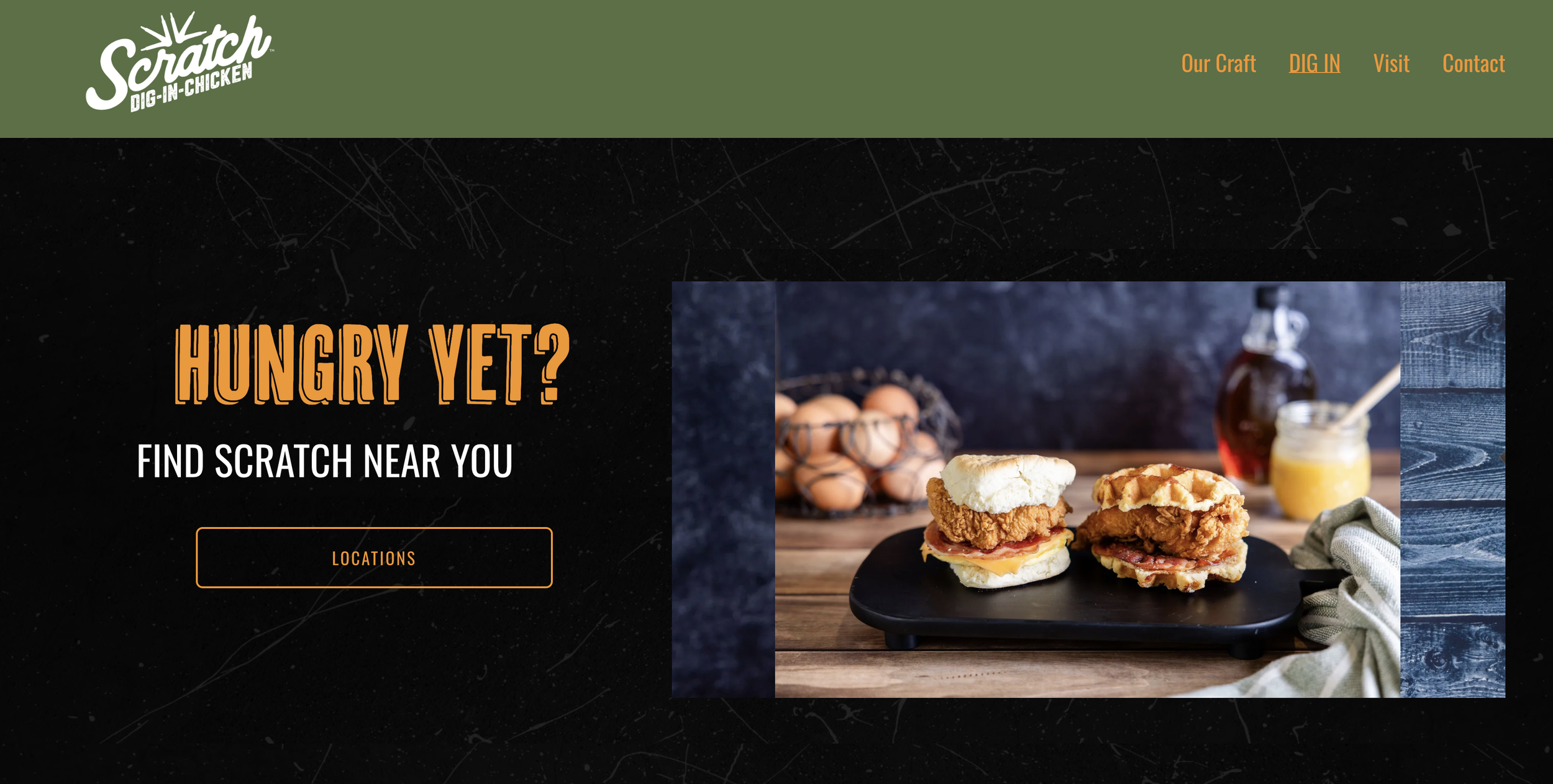
Updated Brand Imagery and Identity for Fast-Food Chicken
Brand Overview
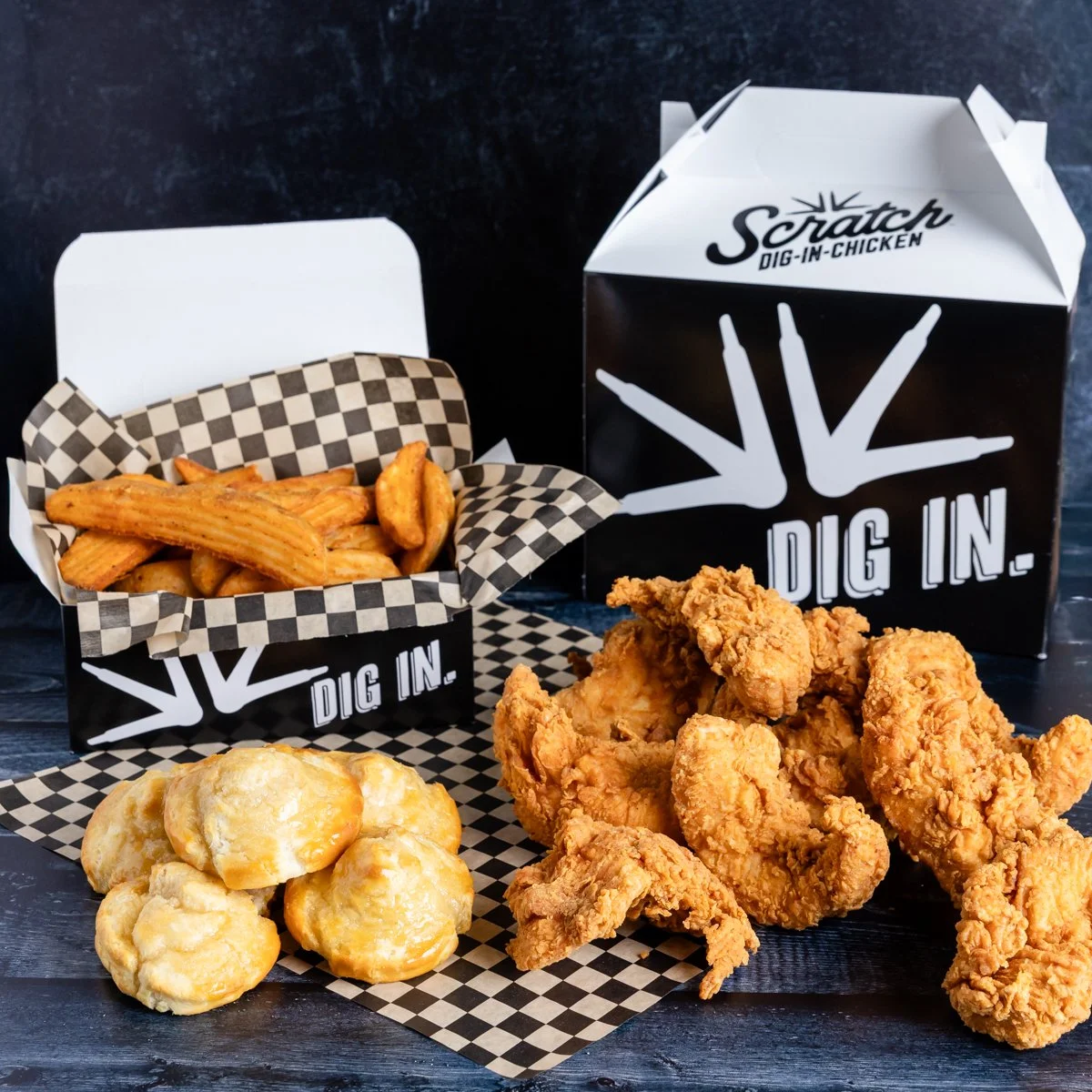
Scratch Dig-In Chicken is a brand owned by Harbor Wholesale, a West Coast convenience store, neighborhood grocer, and quick-serve restaurant distributor. This craveable chicken brand transcends your typical convenience store chicken with an identity that feels more elevated and gourmet than you would expect.
Project Objective
This is a brand I’ve worked with before, and their brand identity was so strong that it caught the competition’s eye, becoming iconic enough that the competing brand actually copied the product imagery and brand identity we had created for Scratch Chicken. So the objective of this project was to pivot! We needed to re-distinguish Scratch as the leading gourmet quick-serve chicken brand.


Production Challenges
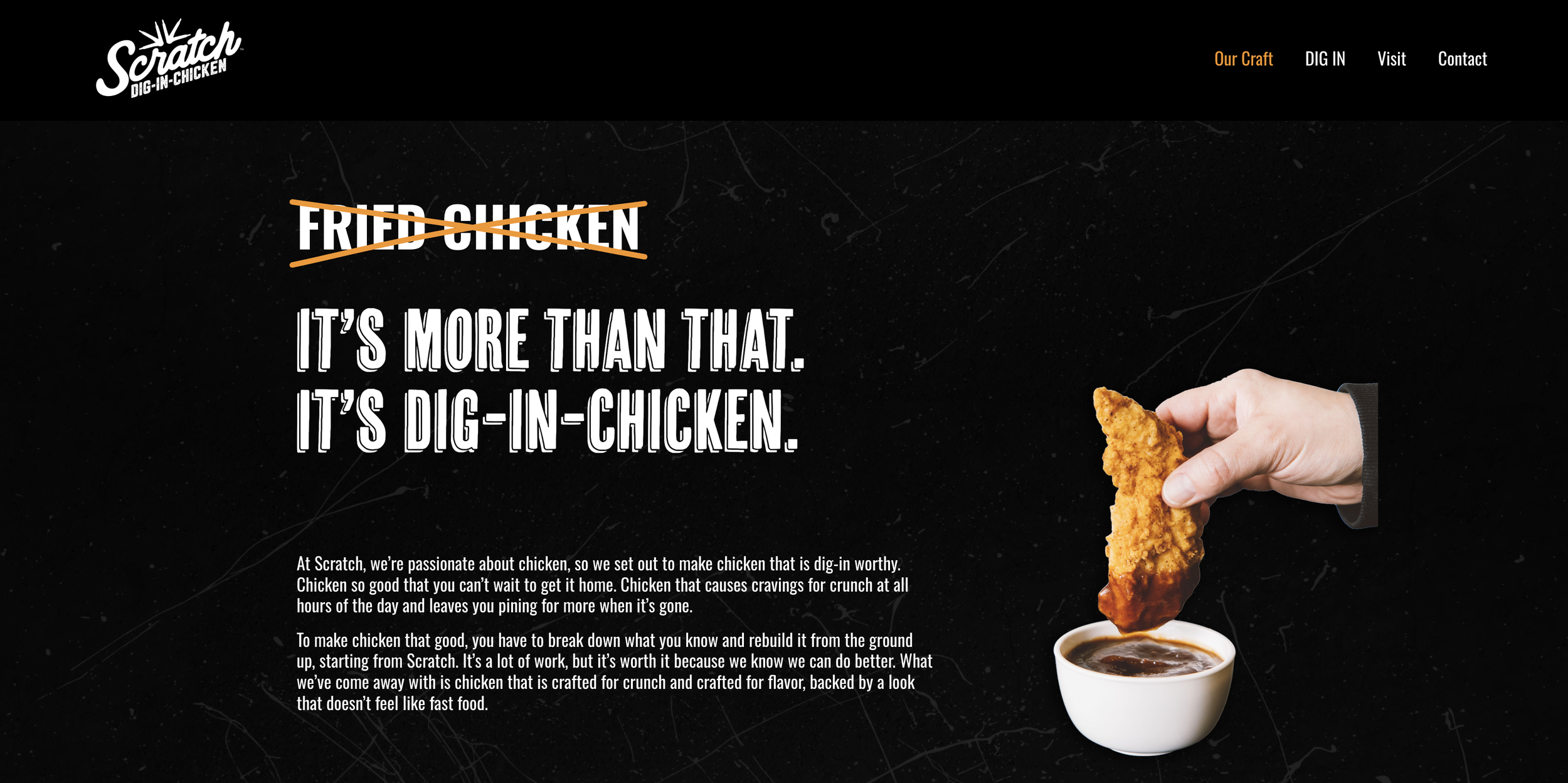
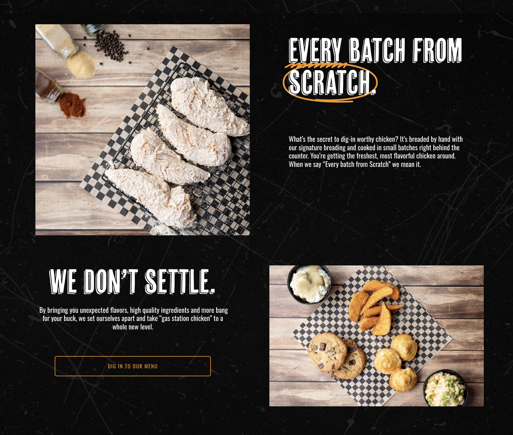
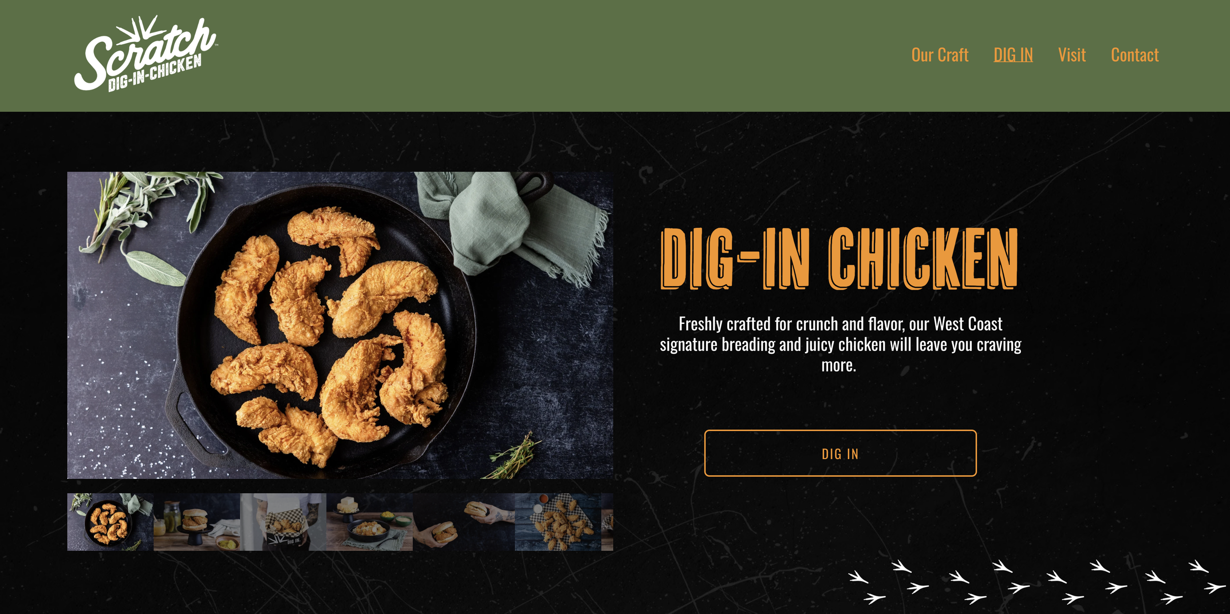
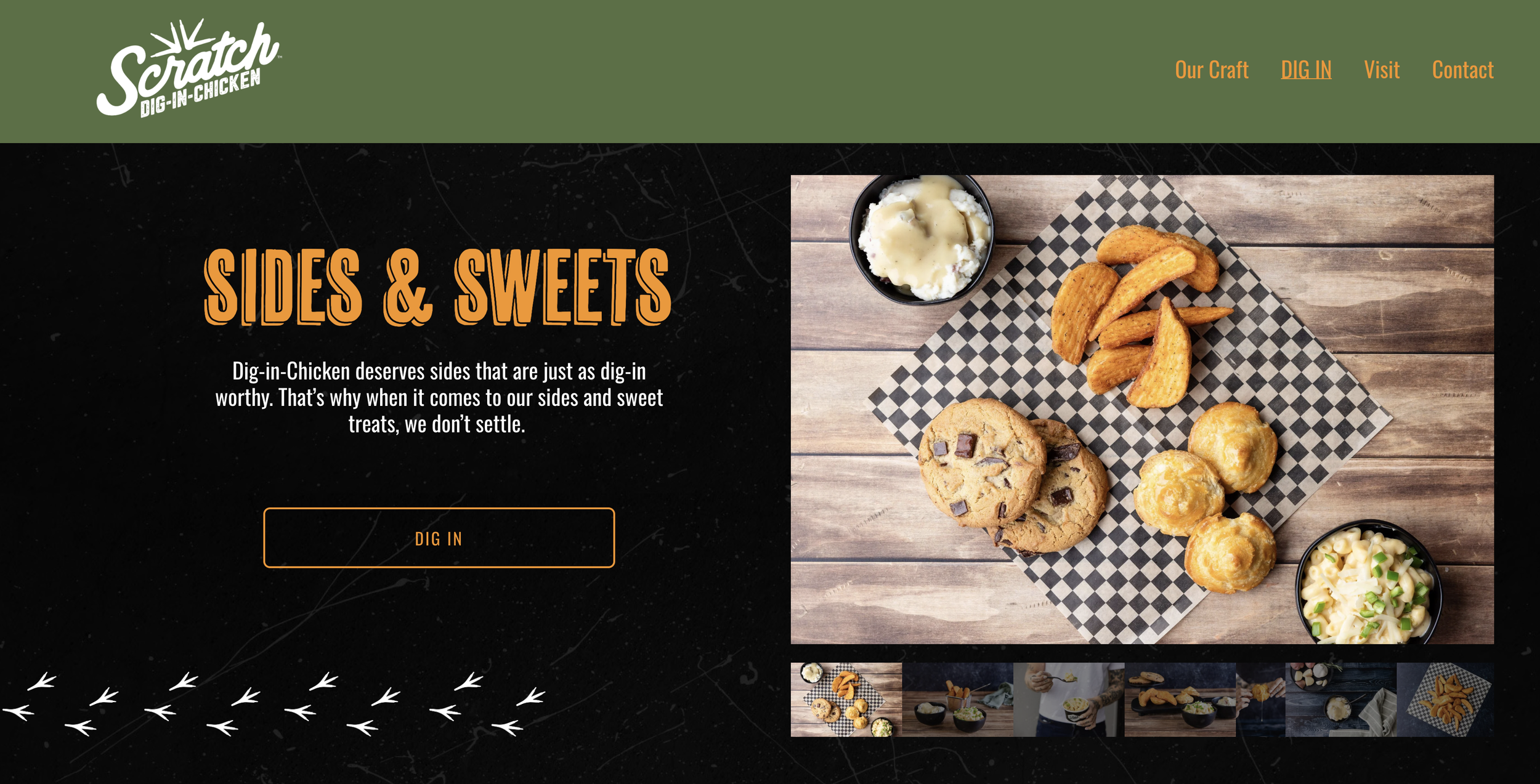
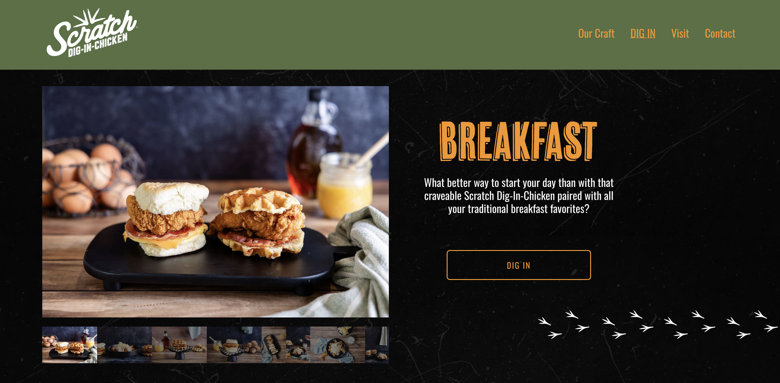
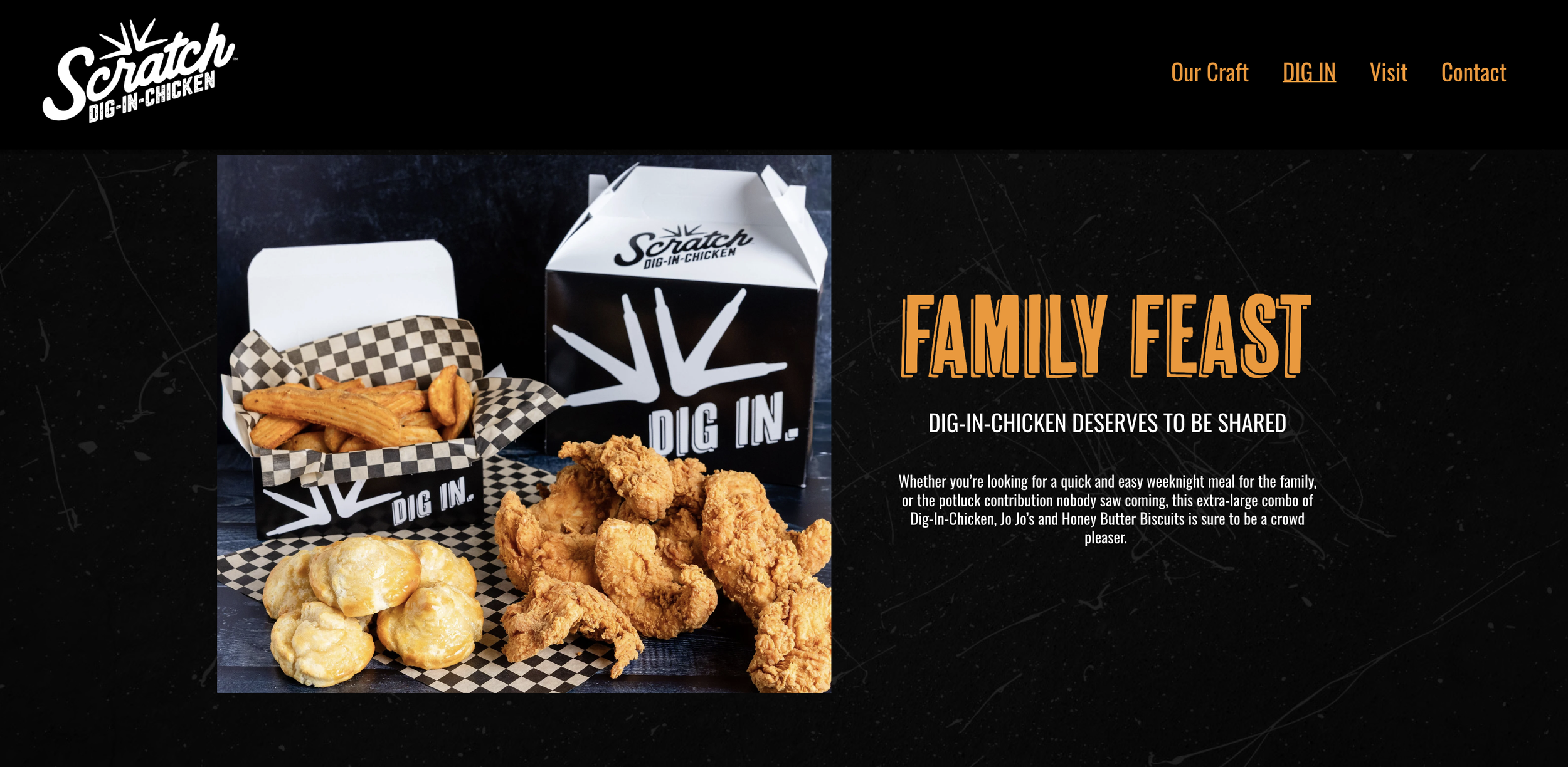
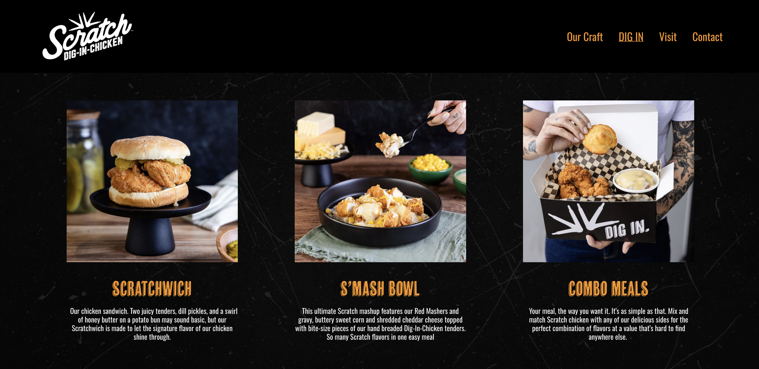
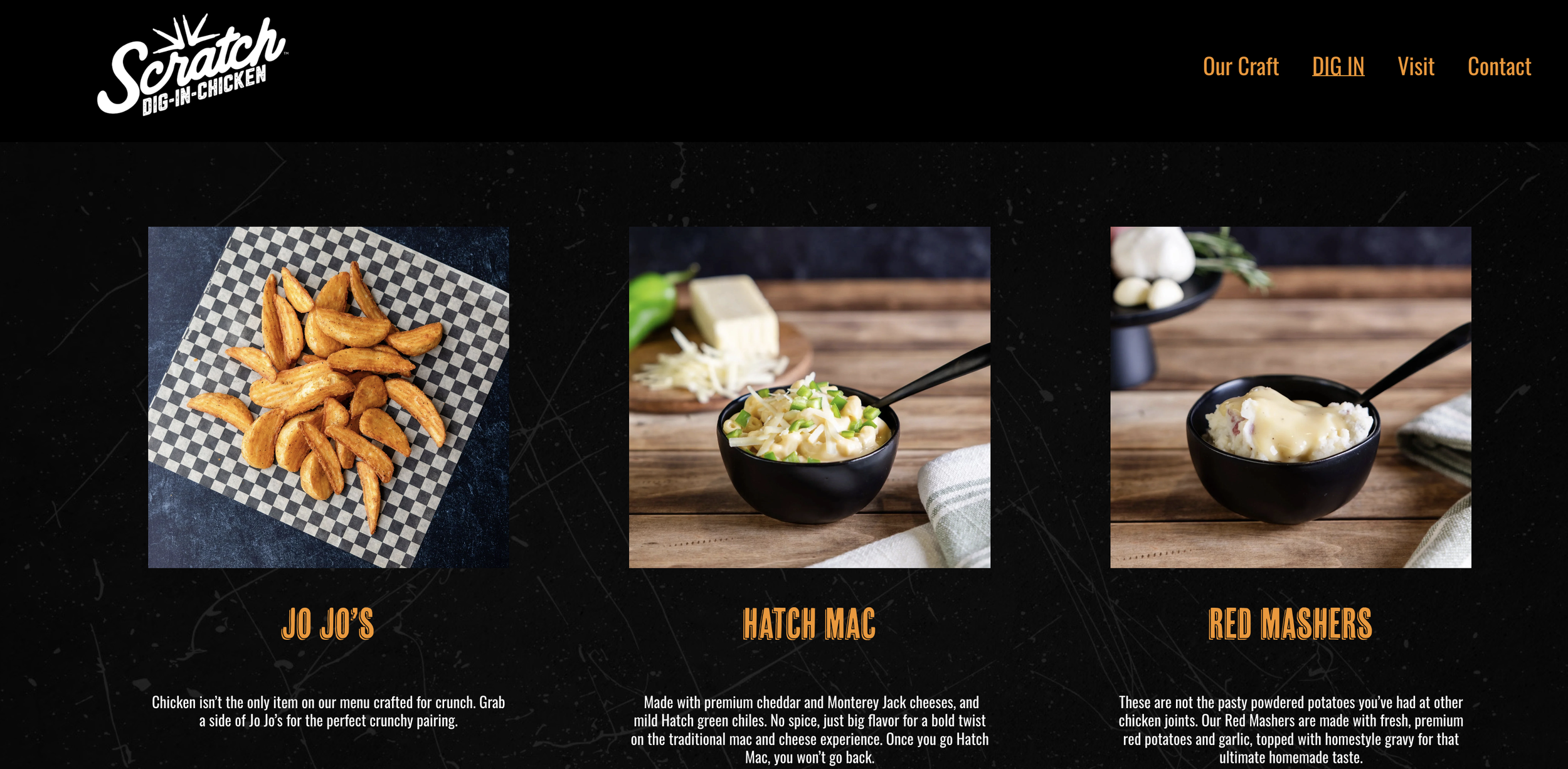
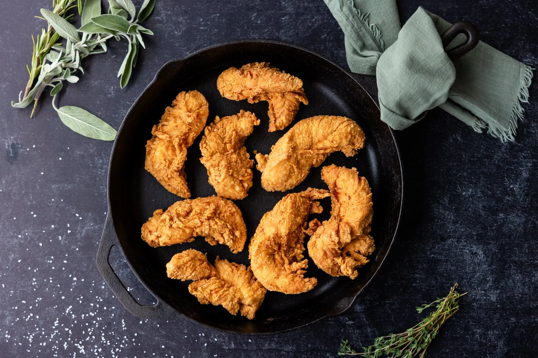
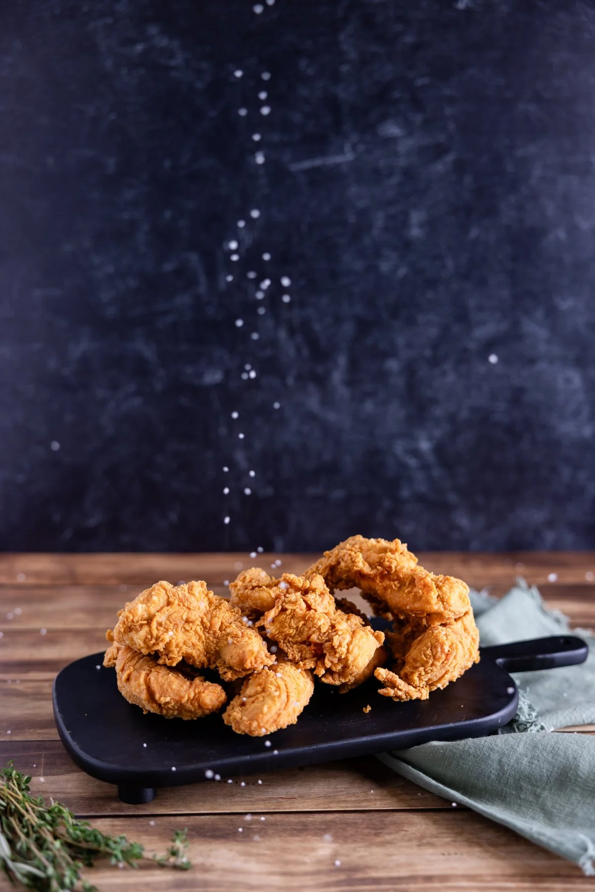
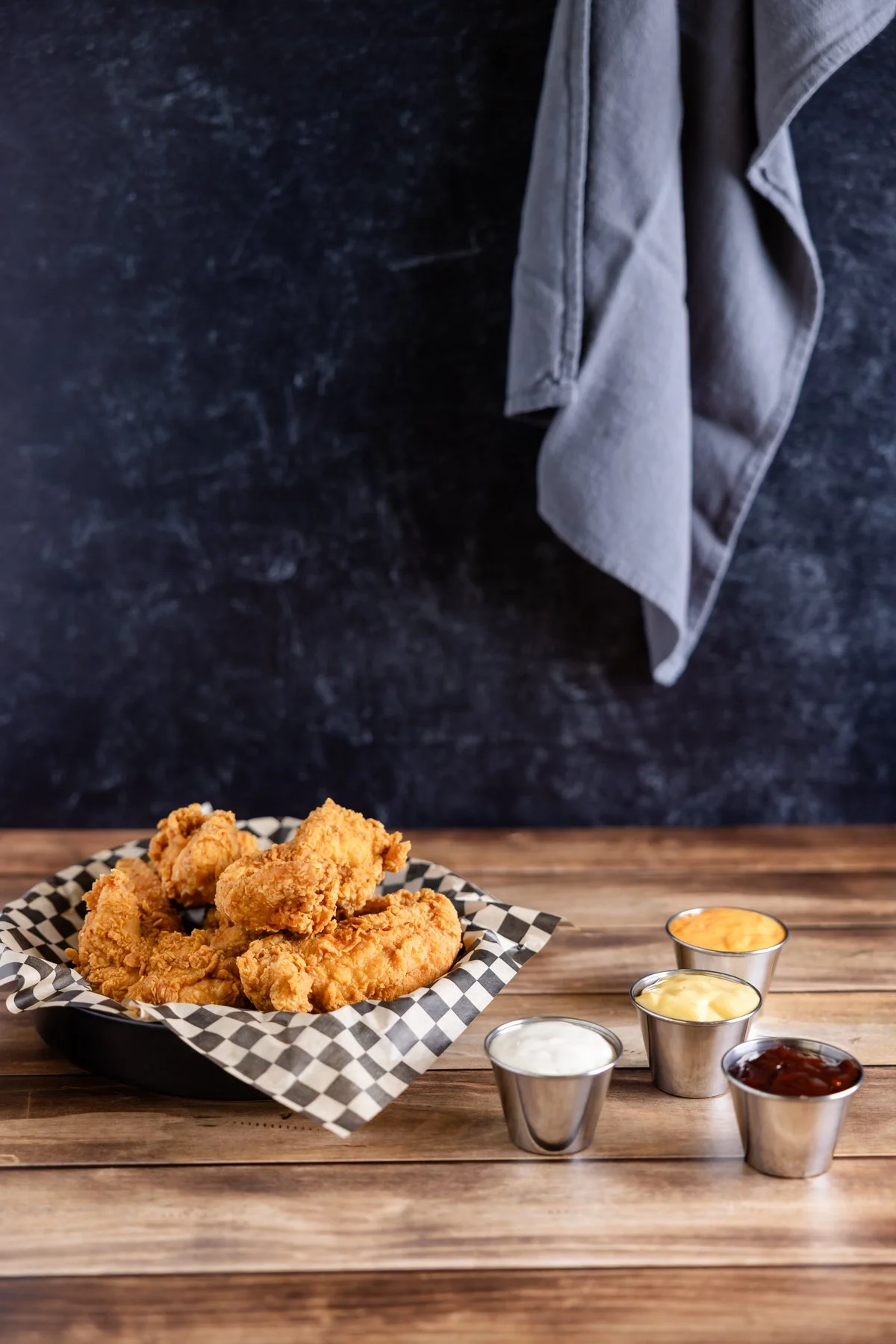
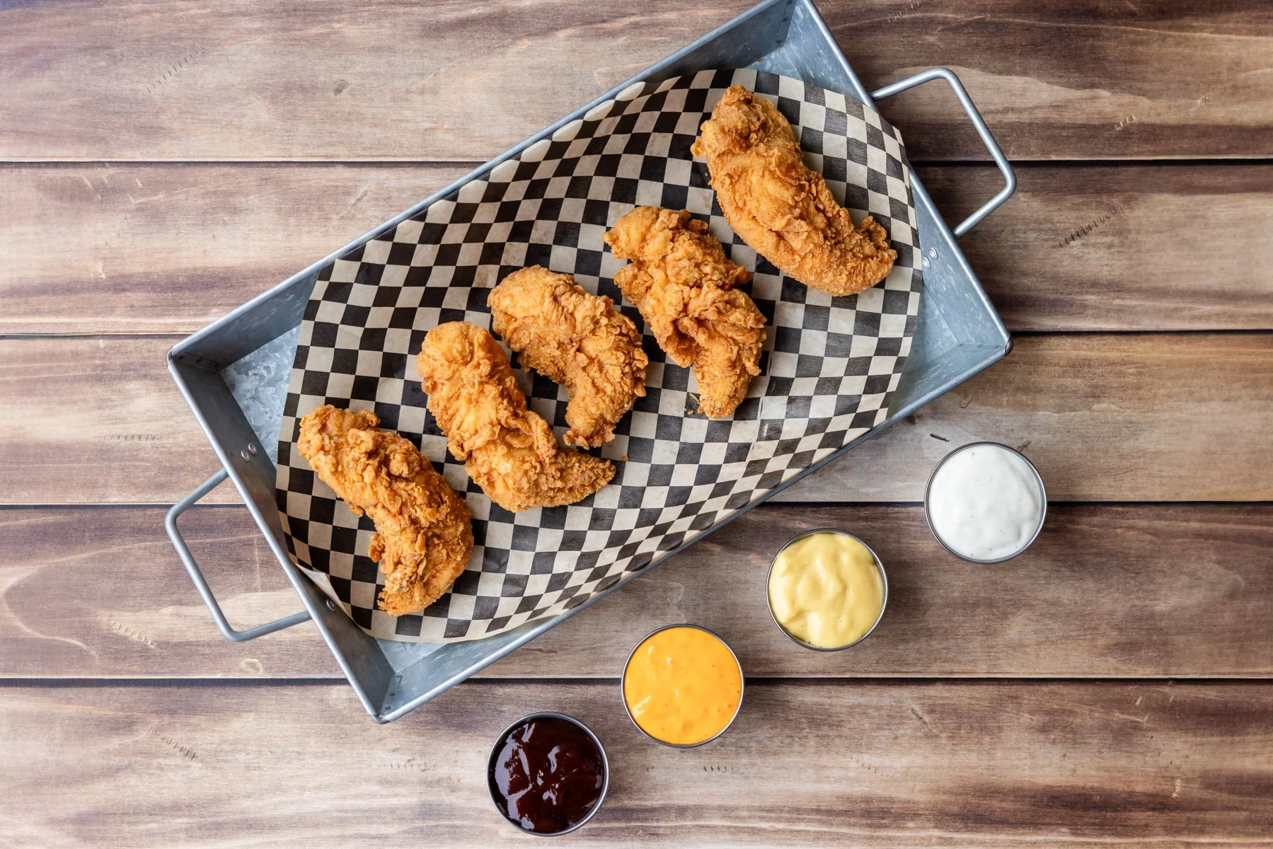
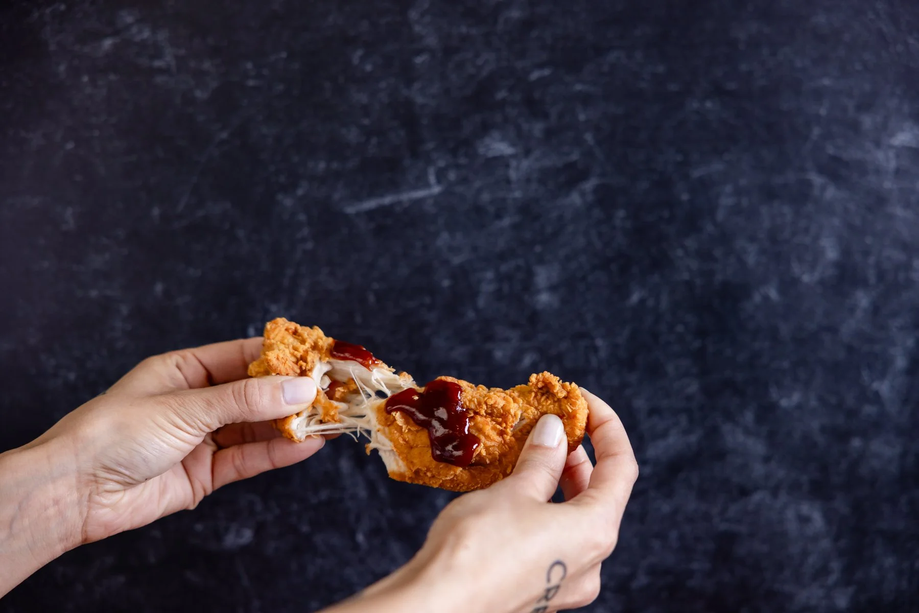
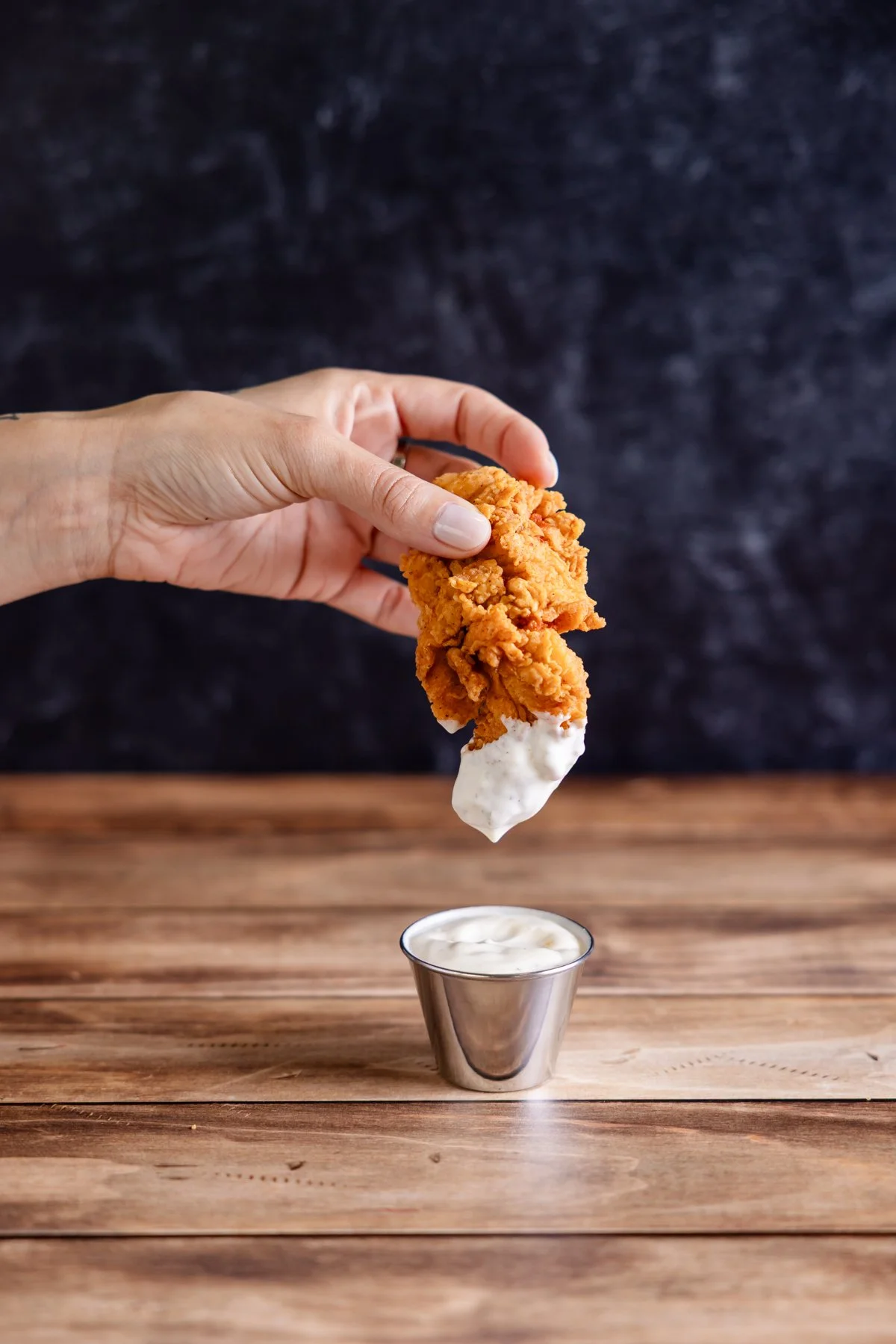
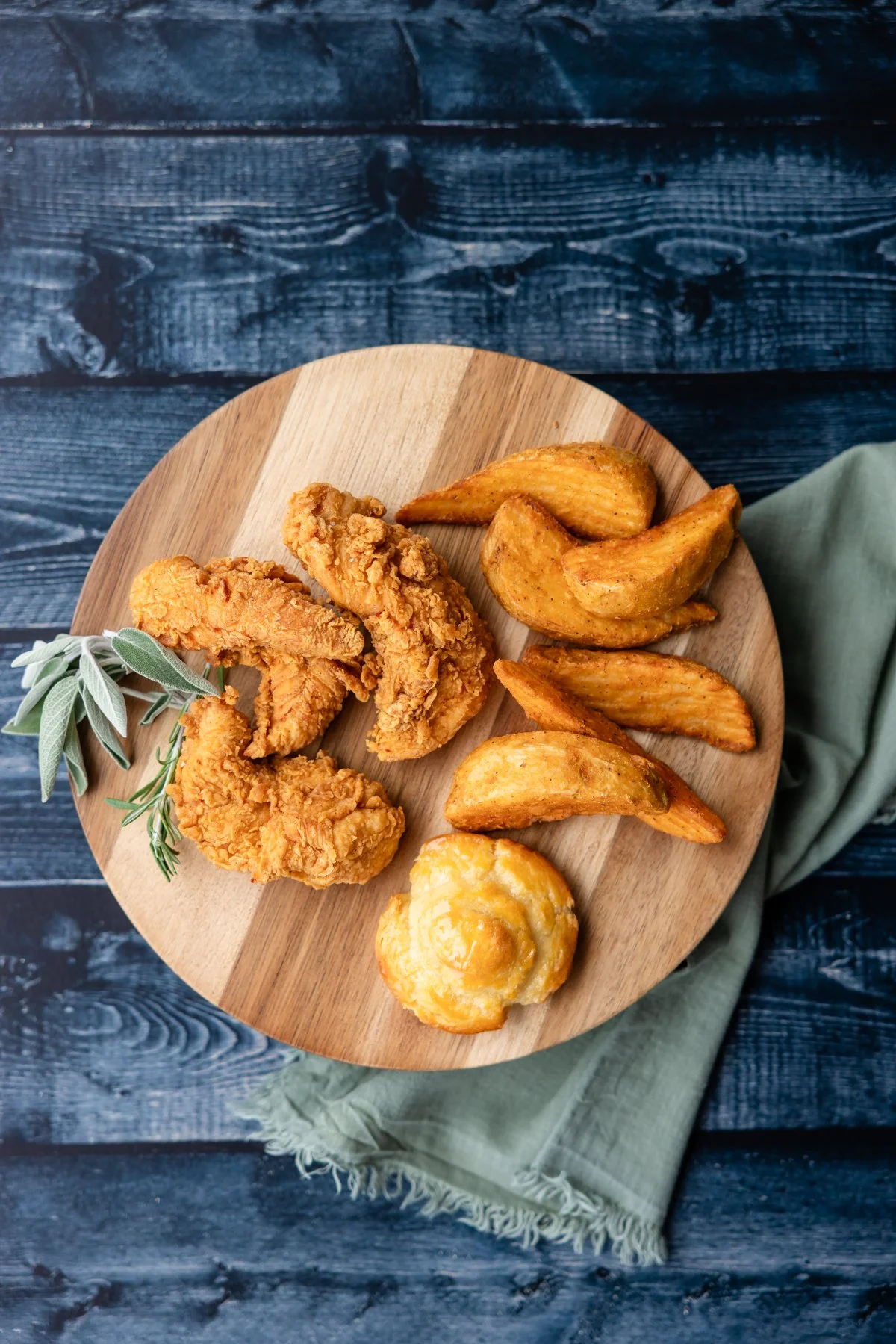
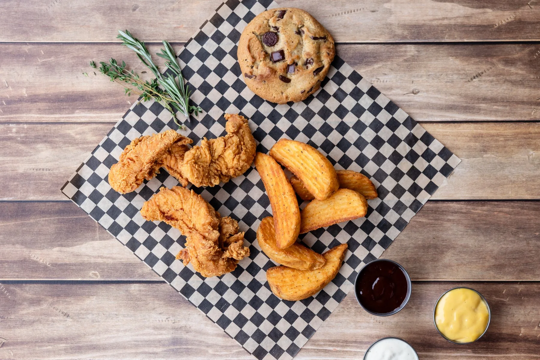
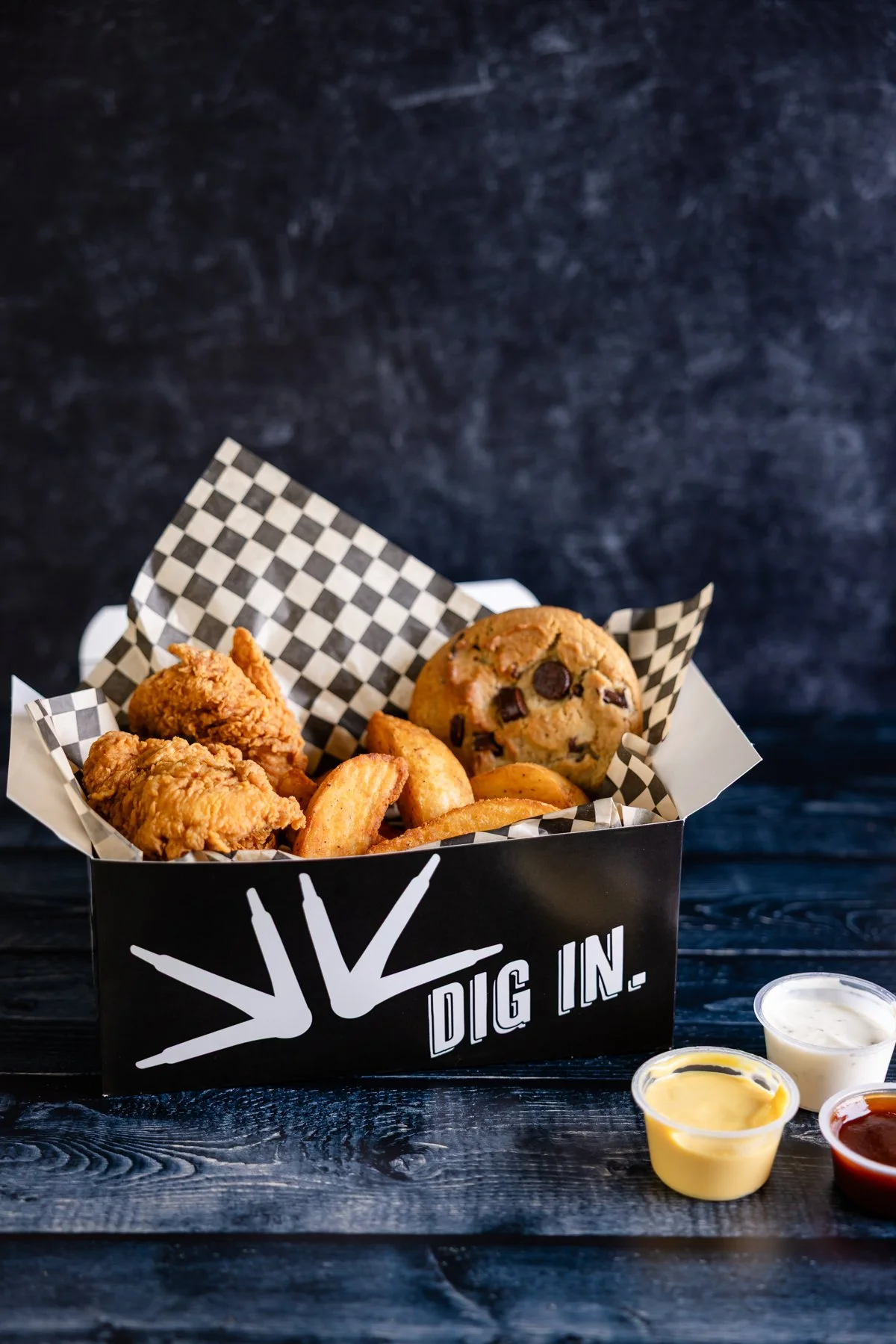
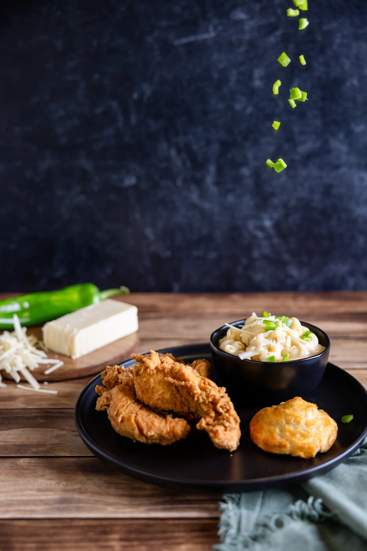
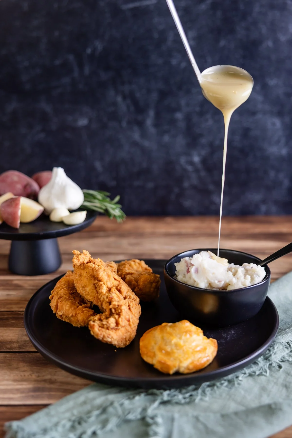
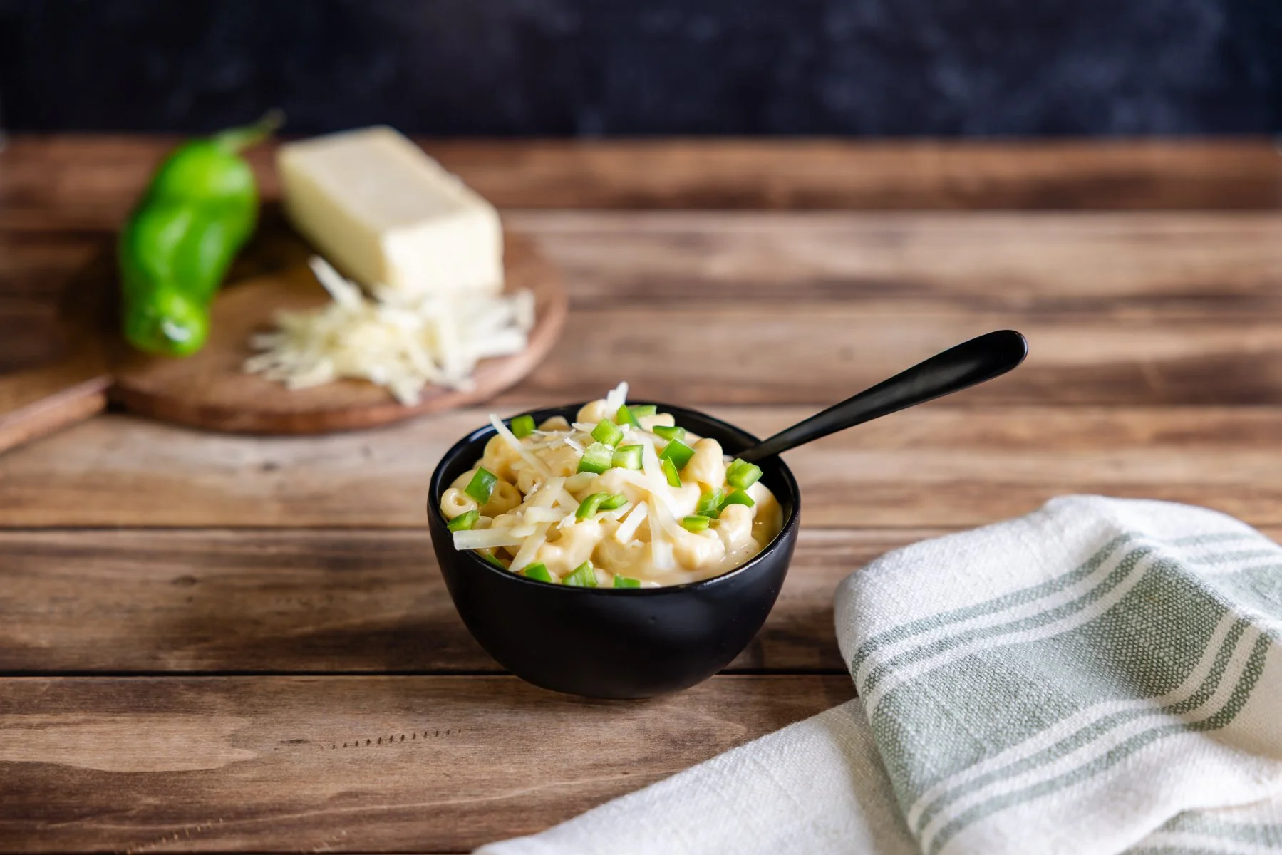
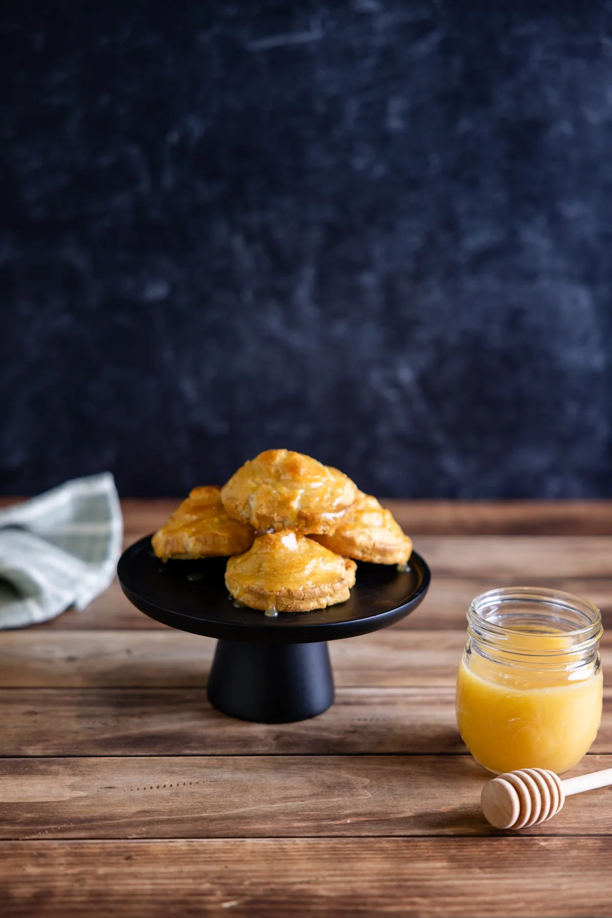
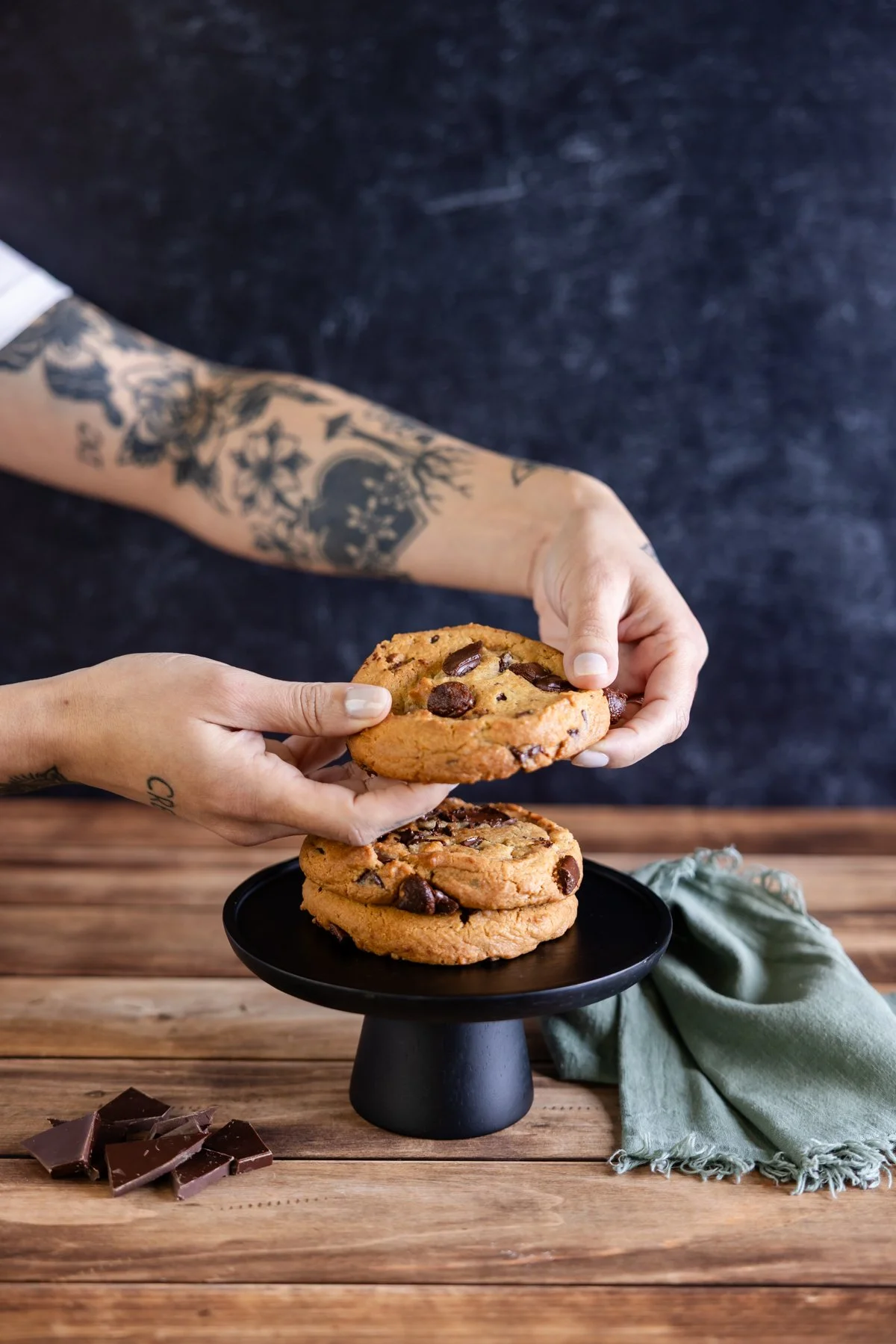
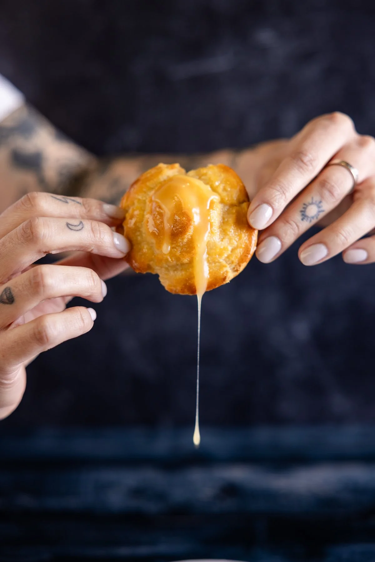
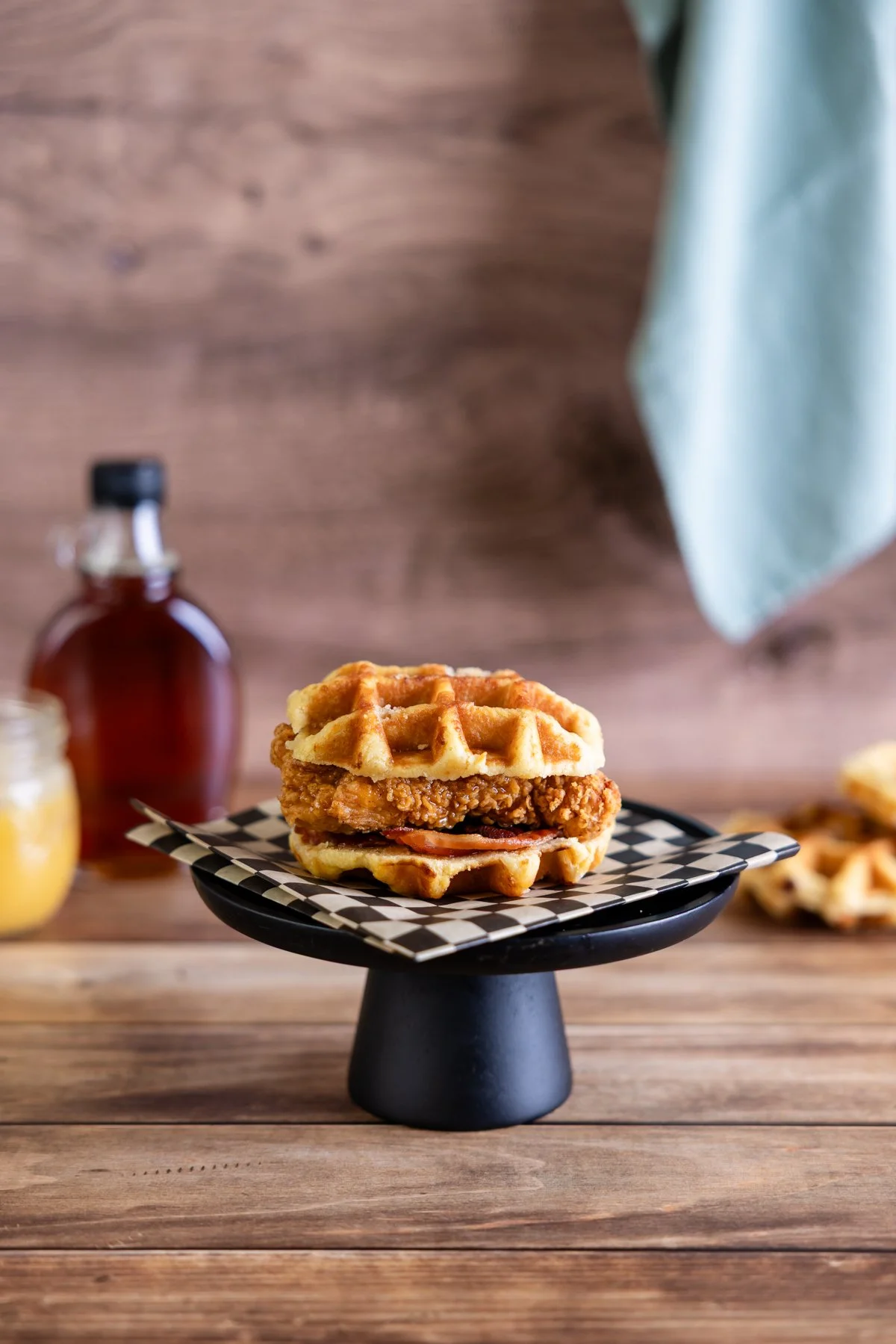
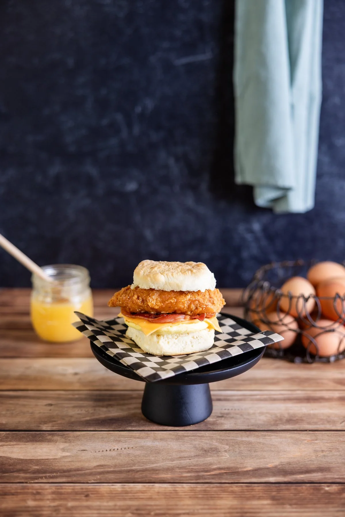
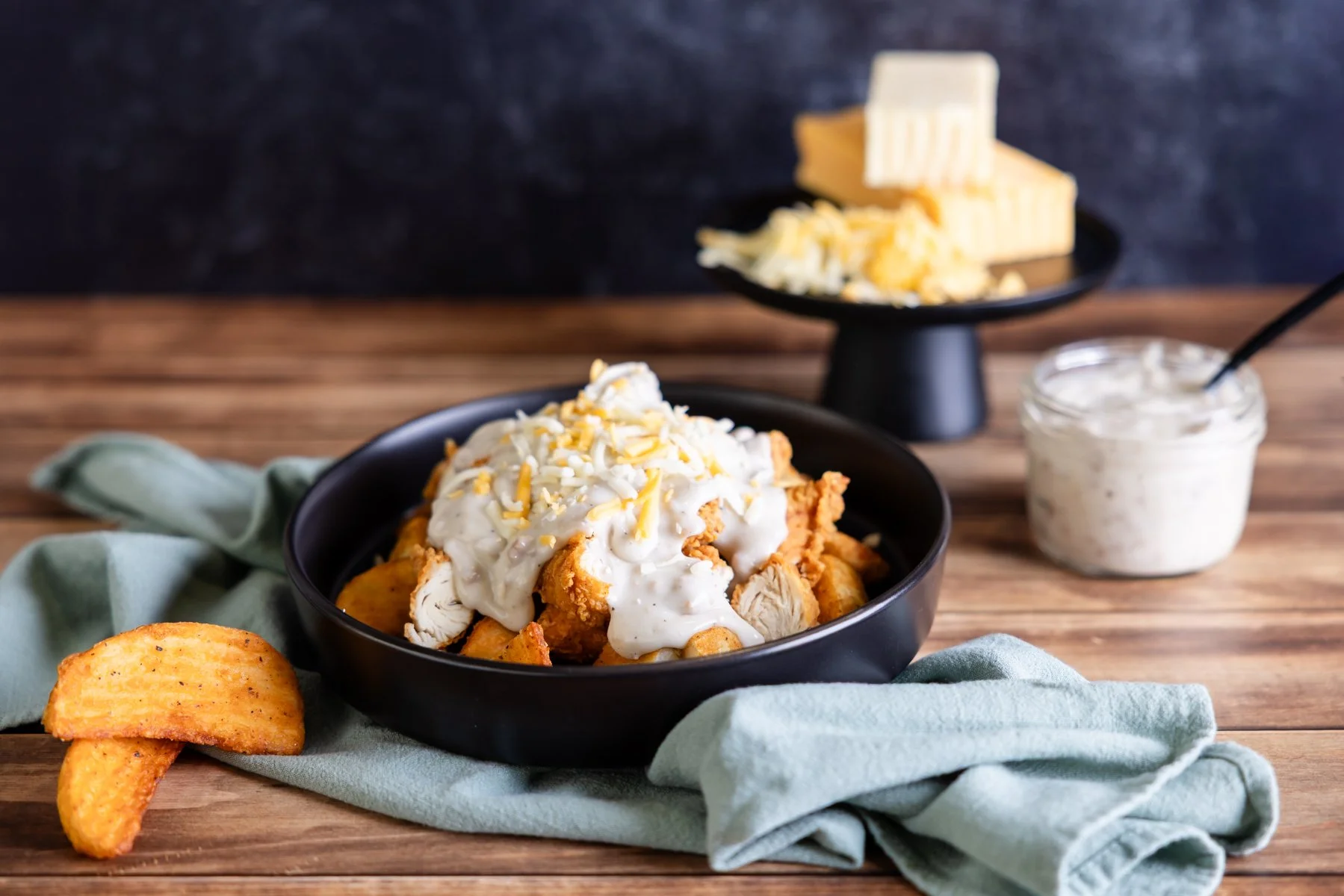
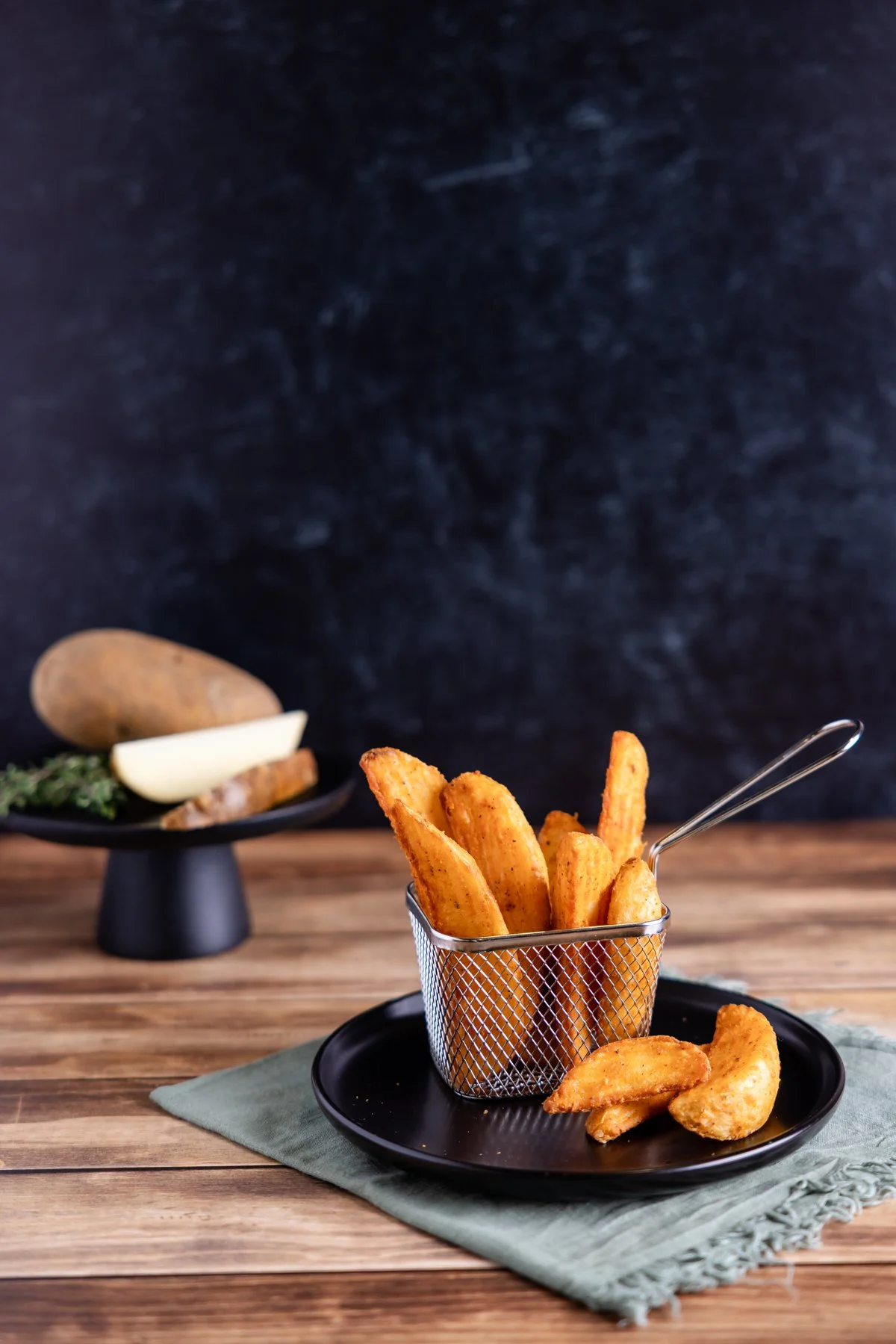
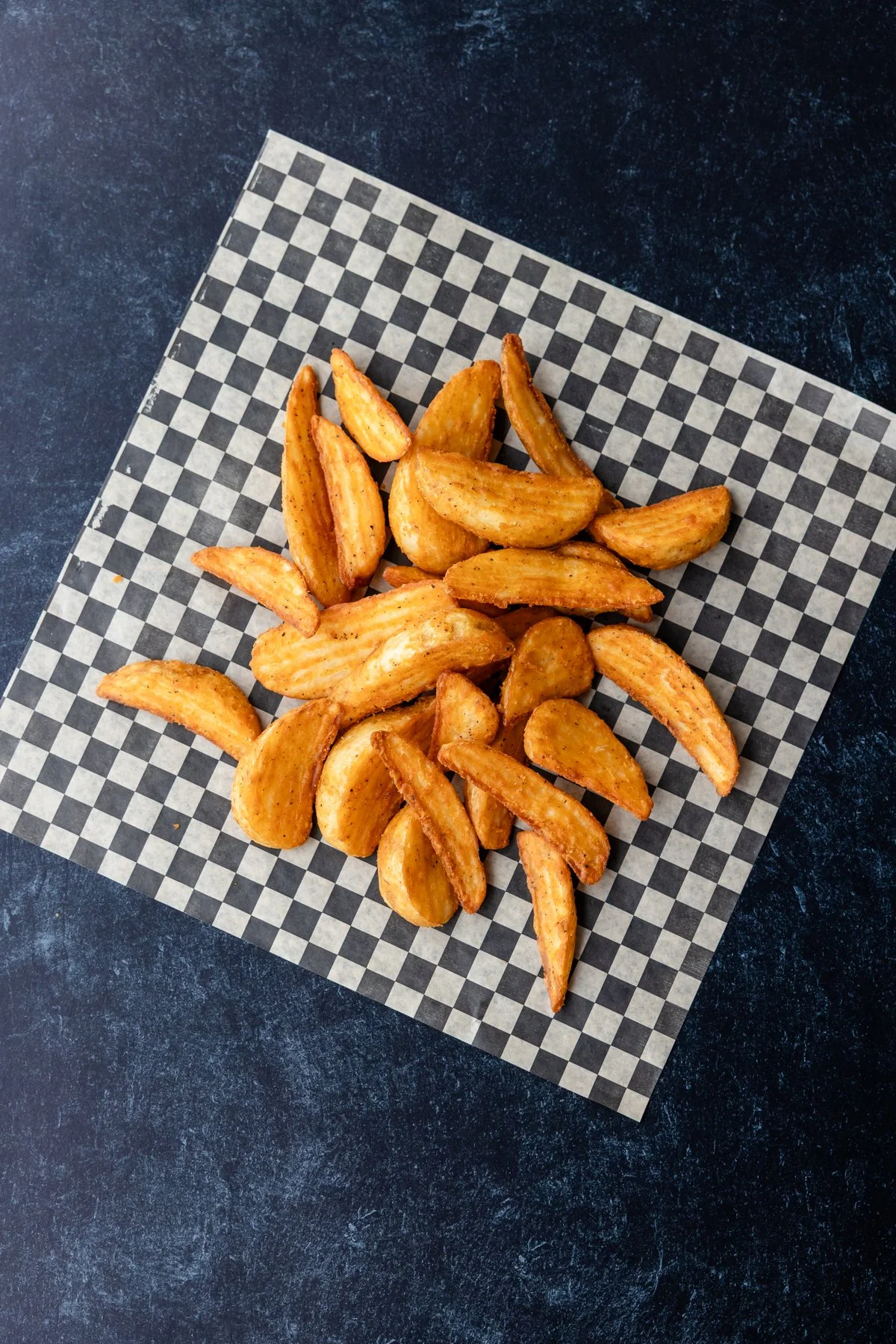
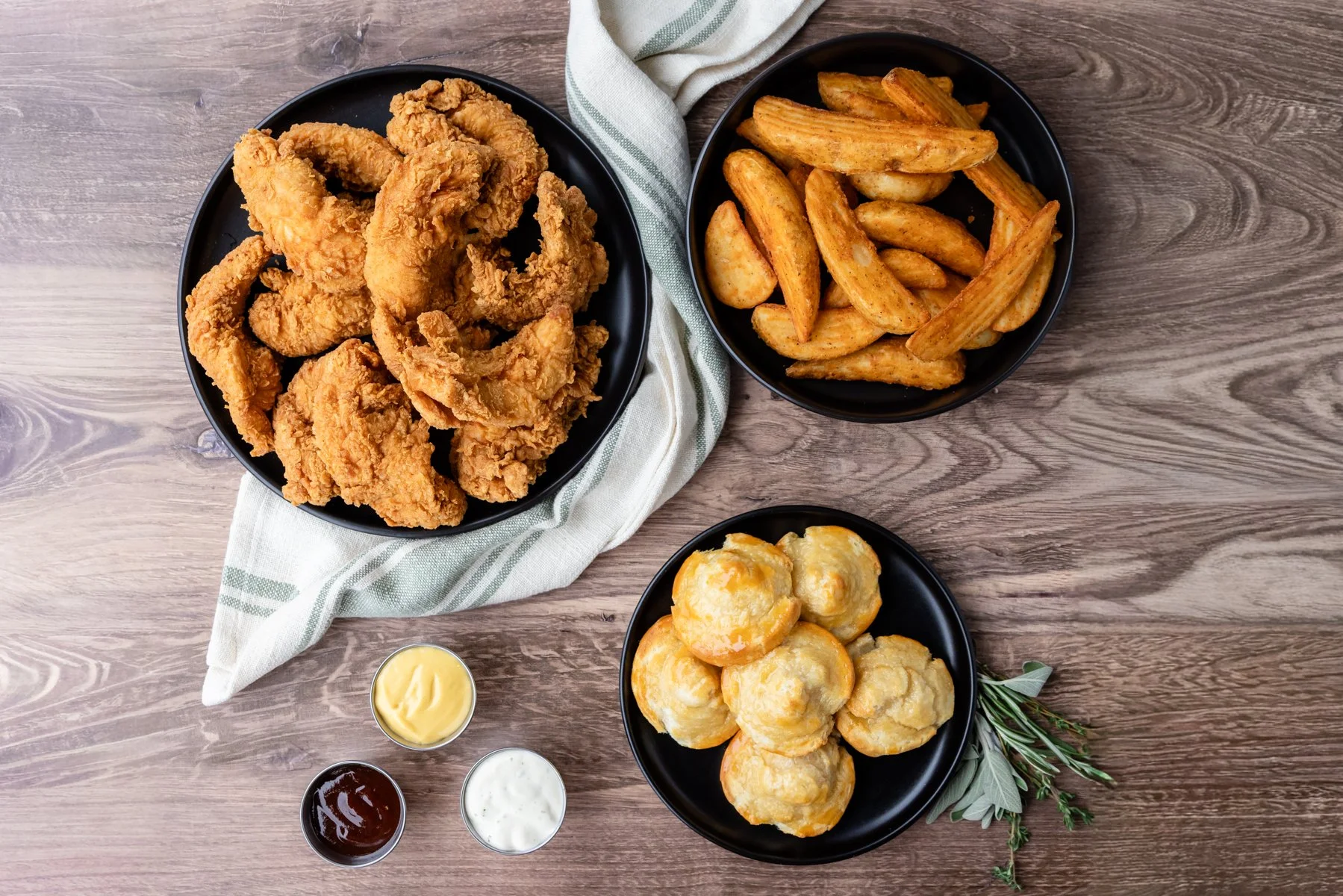
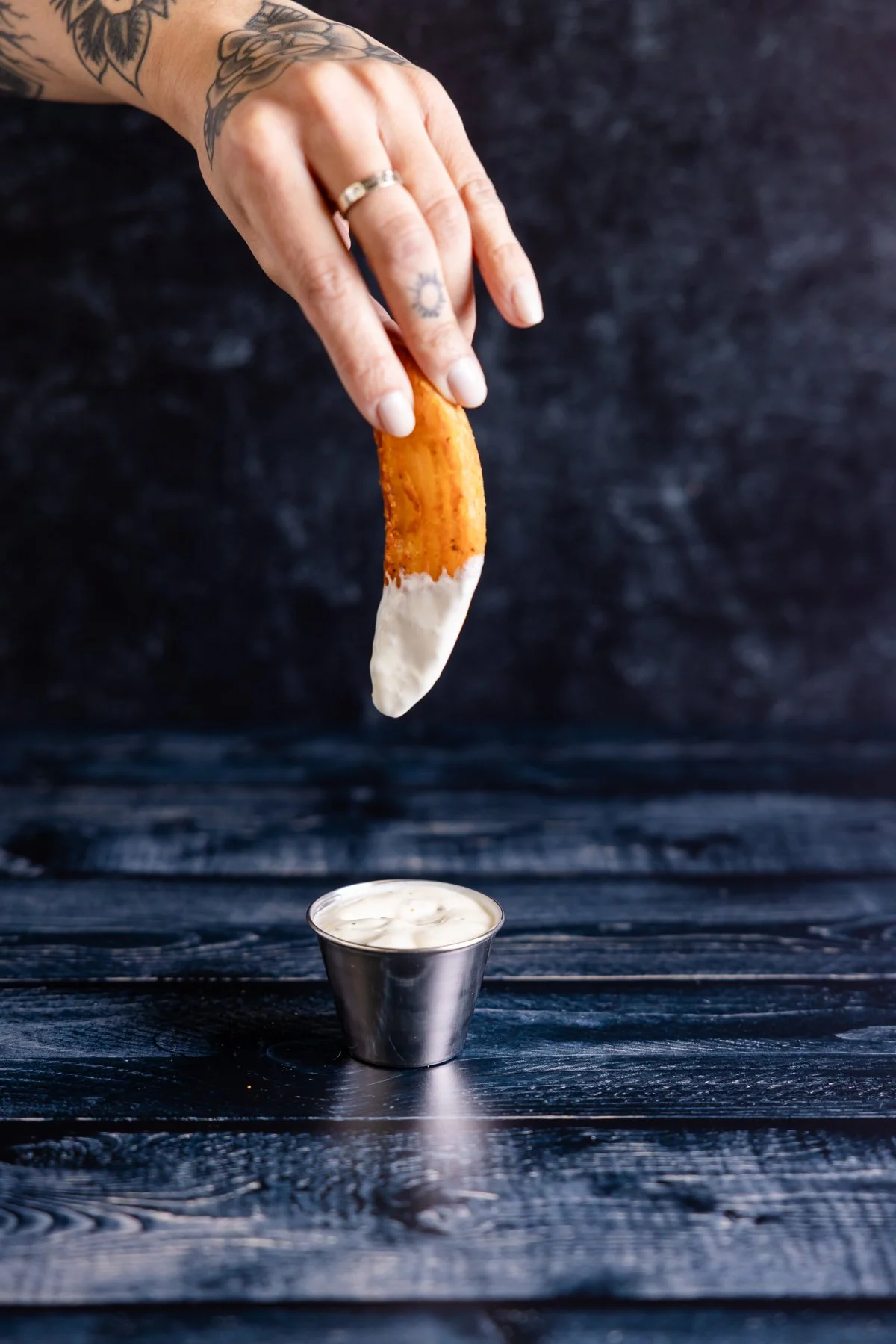
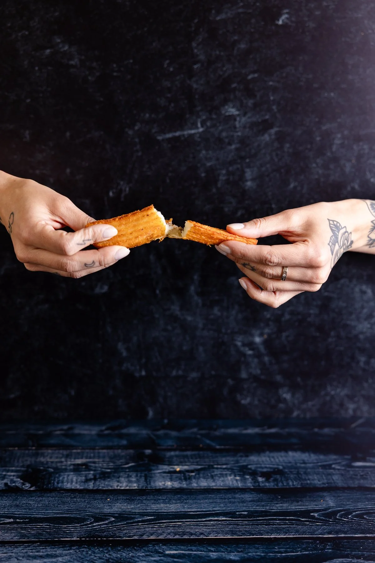
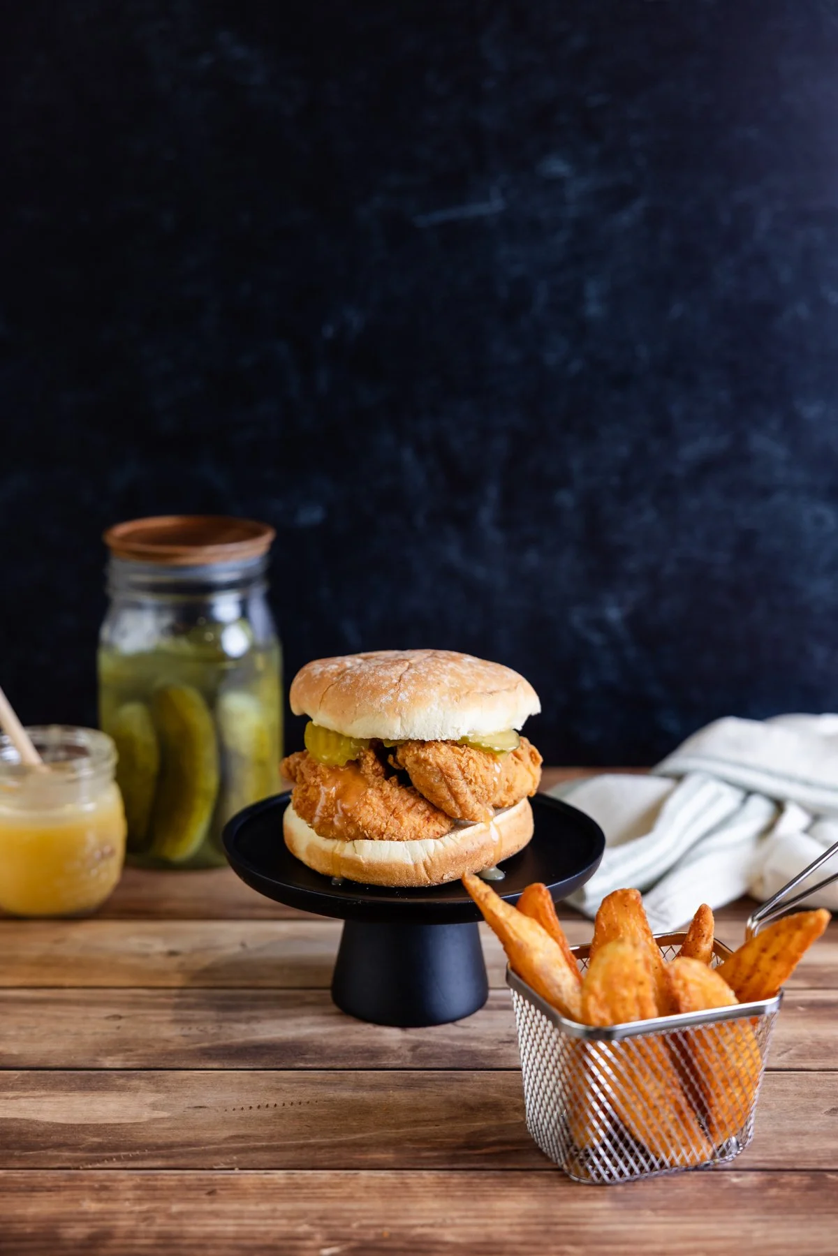
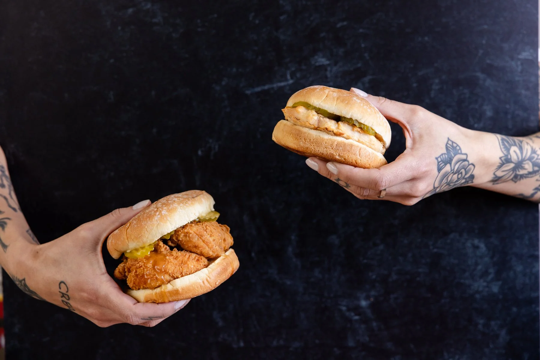
The challenge was to redirect our thinking for this brand and recreate its brand identity through imagery that wasn’t completely unrecognizable, but different enough to stand out. With our goal being to eliminate any of the lighter imagery we had created before, we decided to focus on darker tones throughout the imagery for the brand. This was a very large-scale shoot with over 30 menu concepts and multiple angles per concept, so we needed to be very organized ahead of time to make sure we didn’t miss any crucial shots.
Creative Process
In collaboration with the brand manager at Harbor Wholesale, I helped to plan a shoot using only darker backdrops with distinct pops of green from herbs and linens, leaving the light and bright backdrops behind. Instead of using white subway tile and light distressed wood surfaces, we stuck to dark slate and walnut backdrops. We were very intentional about re-creating similar imagery from our first photoshoot for this brand, with the new darker vibes to set it apart from the competition.
Images In Use